Today, I’m starting a new blog series, “Cards that Don’t Always Make the Cut“. Sometimes I don’t share every card made and it’s for a couple reasons: (a) the design didn’t turn out the way I envisioned or; (b) I didn’t like the finished design.
I decided to make a platform to share these types of cards just in this series and talk about why I chose not to post these on social or give them their own post. You may agree or disagree with me as I’m kinda “picky” (maybe too much LOL! :P).
Card Design #1
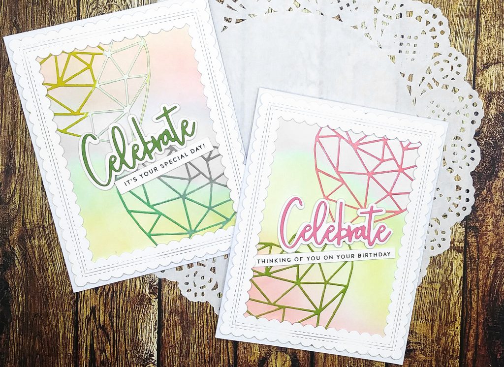
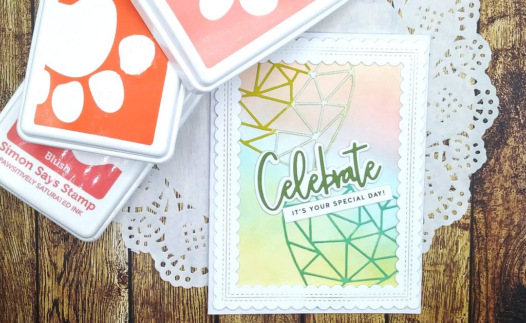
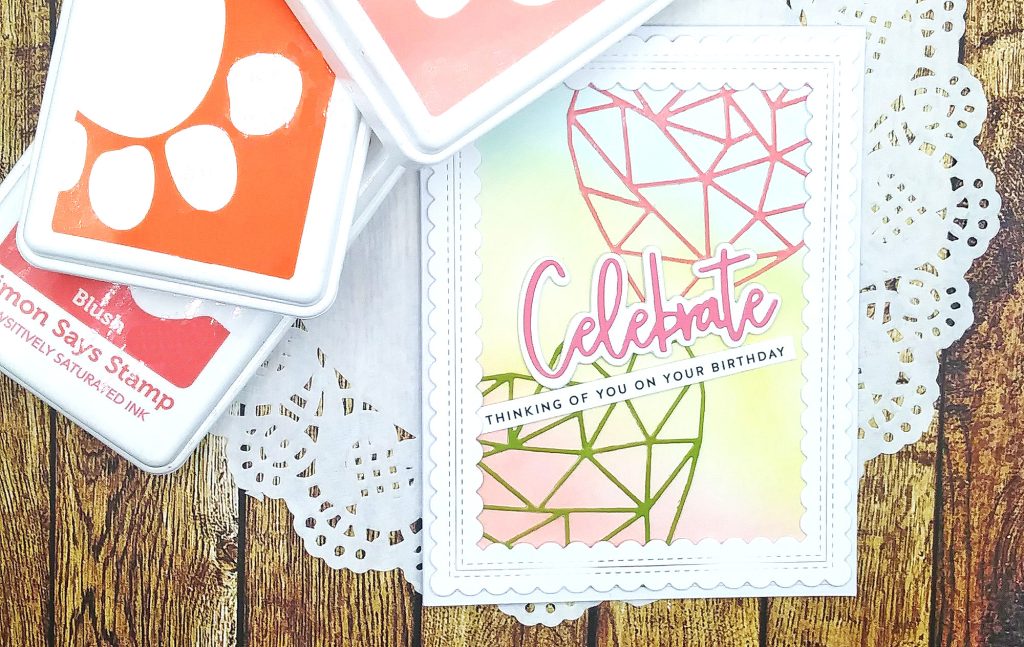
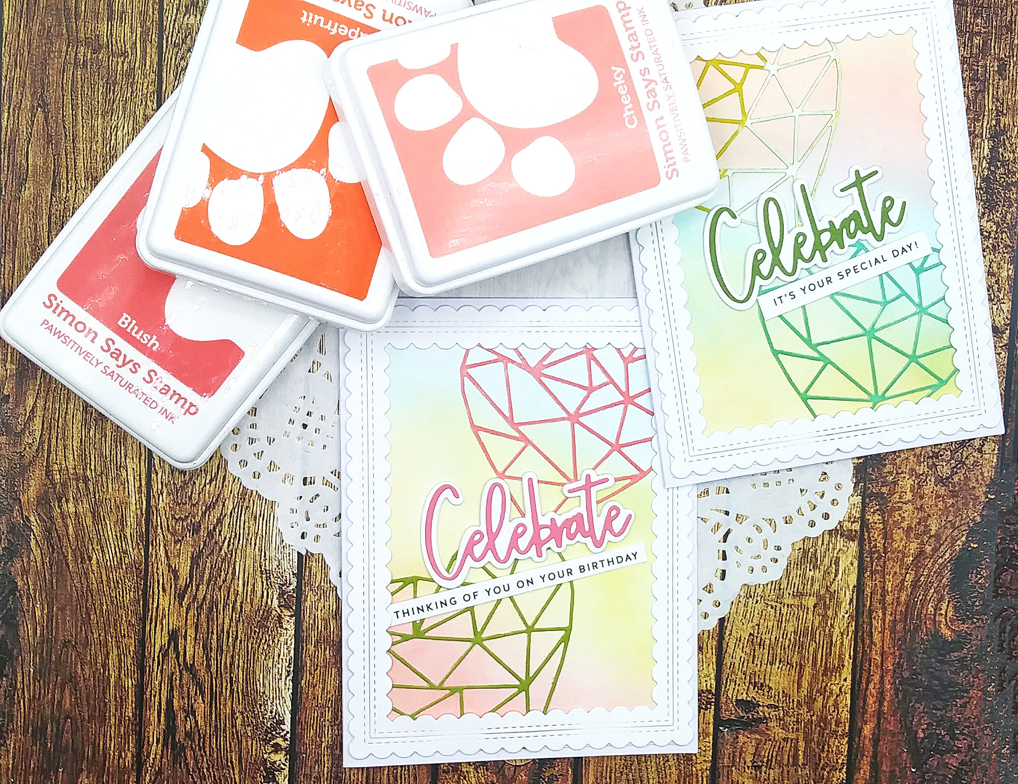
This first card above was meant to be birthday cards and I started out with ink blending the backgrounds using Simon Says Stamps’ Pawsitively Saturated Inks. I die cut hearts with Memory Box’s “Crystal Heart” dies on colored cardstock.
The “Celebrate” sentiment is from Pinkfresh Studio’s Essential Classic Word Dies set that I’ve used many times. And the sub-sentiment is from Simon. All was going well putting the cards together, but I felt the design needed something else so I grabbed the scallop frame die set also from Pinkfresh Studio. After adhering it, I realized it covered up the hearts so that you can’t tell they’re hearts. I didn’t catch my mistake until after the glue dried. The thing is; that scallop die can be used with an outer or inner scallop edge and I should have used only the outer. So, these 2 cards missed the mark.
Products used:
- Simon Says Stamp Pawsitively Saturated Inks – Collection #1
- Pinkfresh Studio Essentials “Classic Word Dies”
- Memory Box “Crystal Heart” Die
- Pinkfresh Studio “Scallop” Frame Die Set
- Simon Says Stamp Birthday sentiment strips
Card Design #2
This next card design was simple, but I think too simple. I’m drawn to make CAS (clean and simple) cards, still they have to be interesting and this card didn’t do that for me.
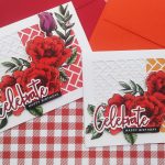
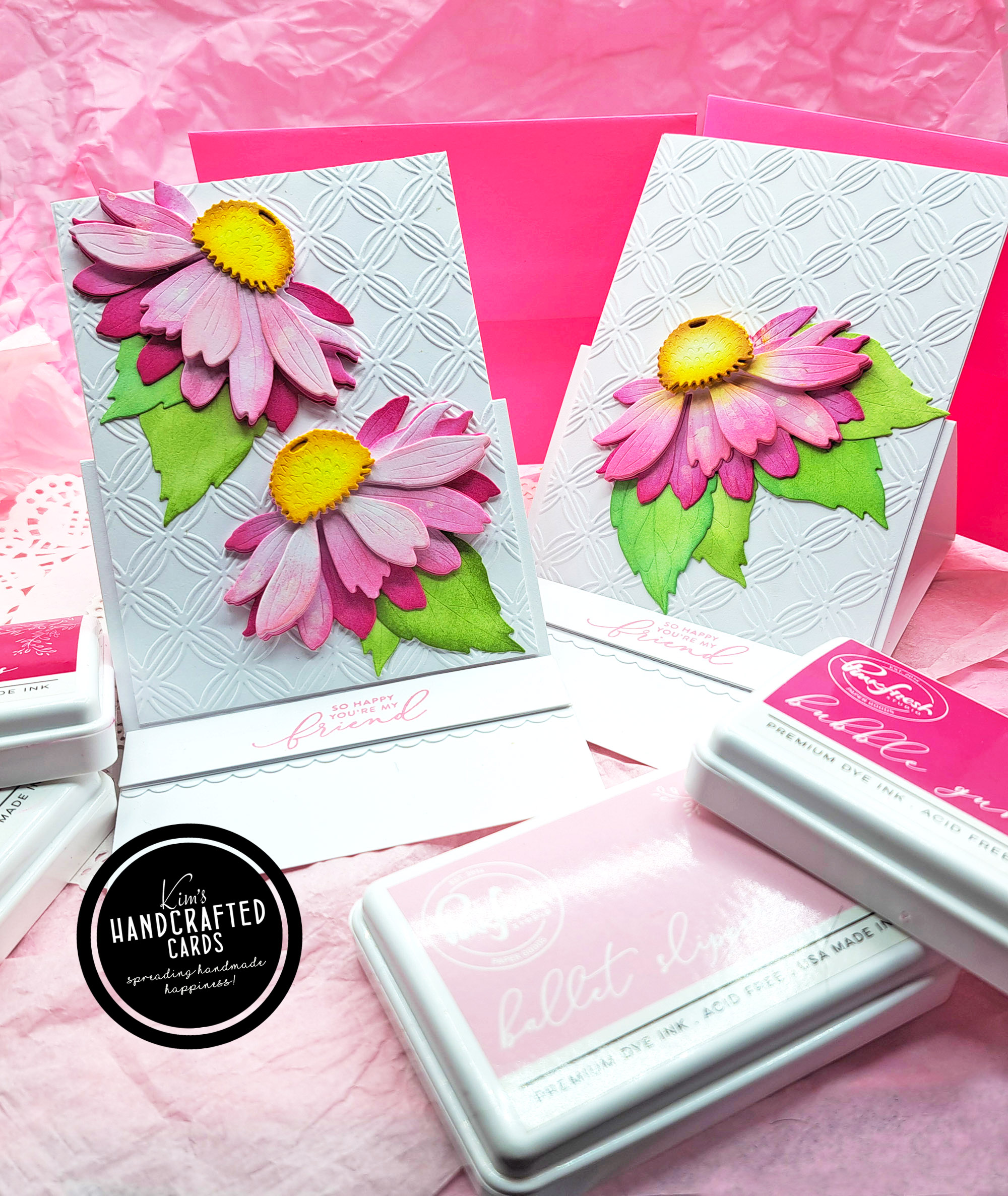
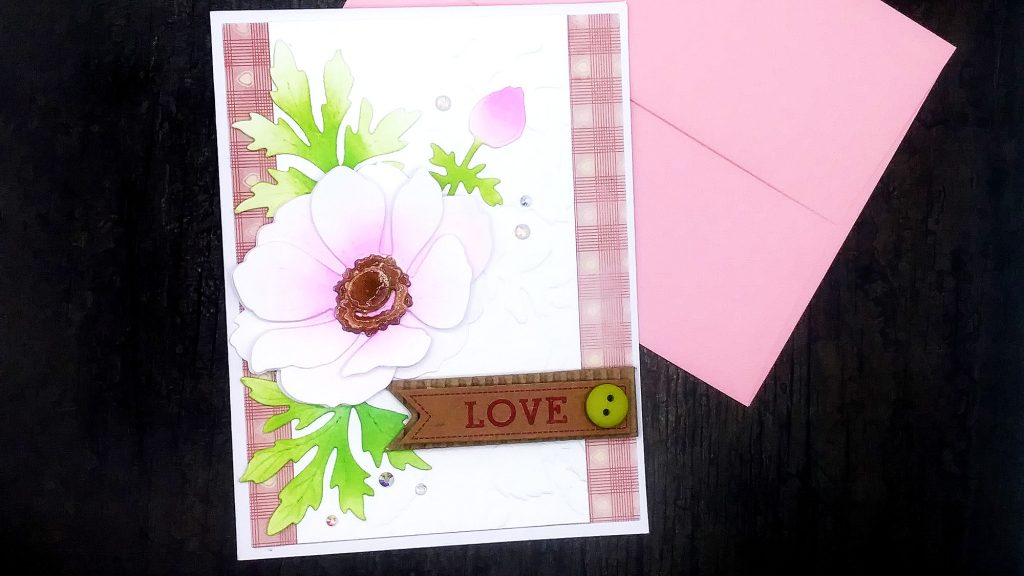
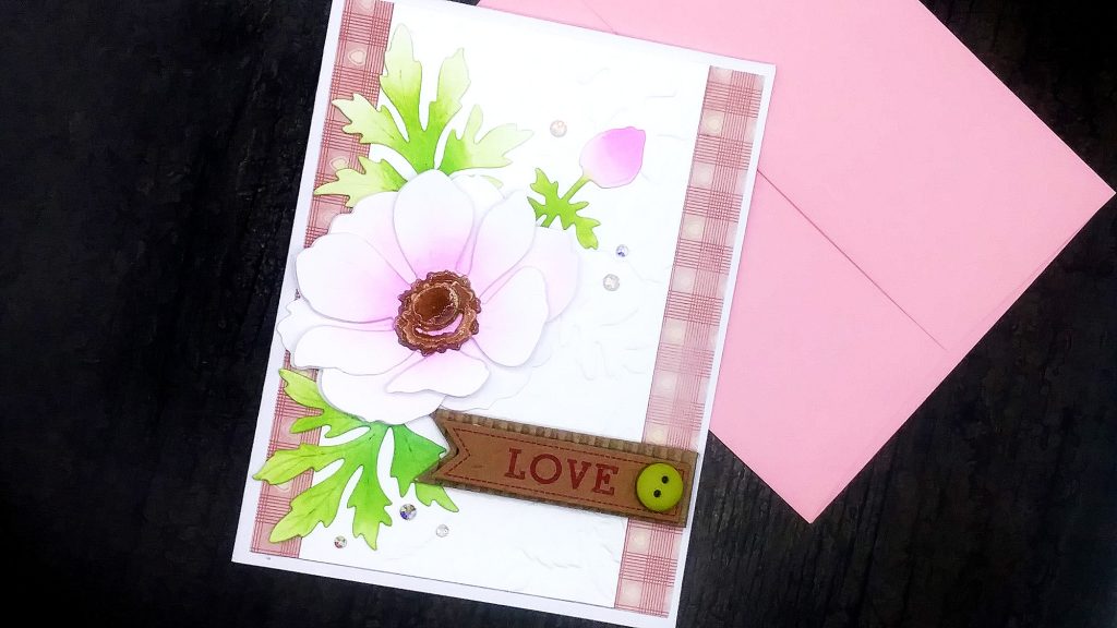
The flower is very pretty and I love it but I don’t feel the overall design showcased it well. The flower die is the Honey Bee Stamps’ Anemone Lovely Layers and I’ve used it before. I ink blended it for this card with Pinkfresh Studio inks. It’s sitting on top of Simon’s 3D embossing folder “Blossom Field“.
The background design is a pattern paper from my stash that I thought would add good contrast. Lastly, I added the Dollar Tree 3D “Love” sticker and a few gems. I just don’t think the elements go well together so that’s why, for me, it missed the mark.
It might have been better to leave off the pattern paper altogether. Instead, I could have 3D embossed the entire panel and sit the flower on top. Then, the card could’ve made an elegant wedding, engagement card or for Valentine’s Day.
Products used:
- Honey Bee Stamps “Lovely Layers” Anemone Die Set
- Simon Says Stamp “Blossom Field” 3D Embossing Folder
- Pinkfresh Studio Inks
Just because these didn’t make the mark doesn’t mean they’re epic fails. I see them as learning lessons for going forward. Sometimes, things go wrong or don’t go as planned in cardmaking. That’s par for the course.
You probably have made cards you weren’t happy with either. You’re not alone. We, makers are hardest on ourselves as we see our mistakes along the way. Sometimes, we rebound very well, sometimes not. This post is an example about a couple of cards that I made some goofs but was able to fix.
In my case, I can’t take myself so seriously that I’m upset and frustrated rather than take the experience, learn from it and keep improving.
Thanks for reading, this is the end of this series for the month and hopefully next month will all be epic successes!

