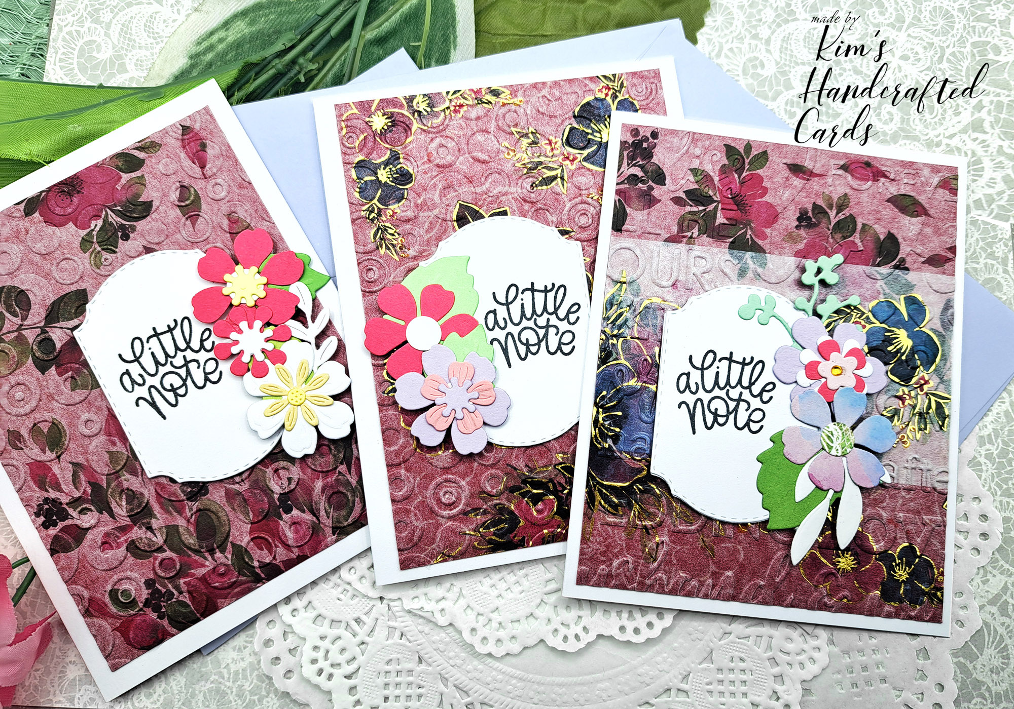
Hi my friends! Happy Wednesday! Hope your day is going great, today I’m sharing 2 cards using the beautiful “Coneflower” Lovely Layers by Honey Bee Stamps. Now, you probably know how much I LOVE, LOVE their “Lovely Layers” collections! I have a bunch of them but not all of them…yet!
Anyway, I’ve colored these florals before, however I tend to stick “too much” trying to make things with realism rather than just playing and you can check out this post to see what I mean.
Last night I was on Jennifer Mcguire’s Facebook Group, “Share Handmade Kindness” when I saw another cardmaker post a beautiful card she made with the coneflower petals in pink! PINK! My favorite color! Now why hadn’t I thought of doing that?!!!
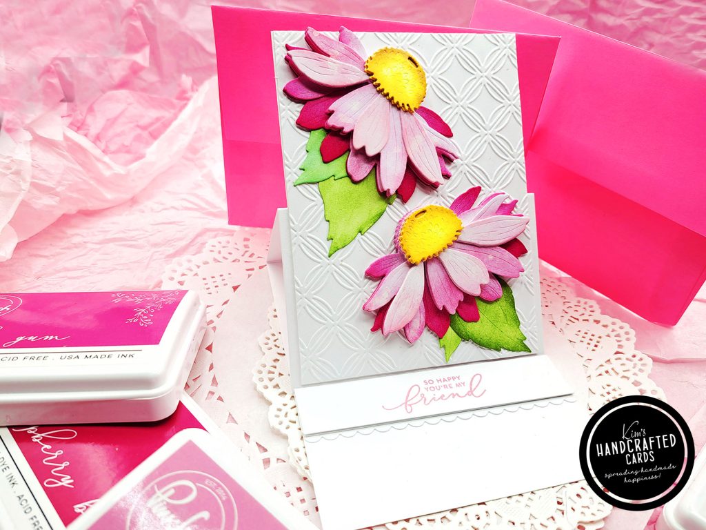
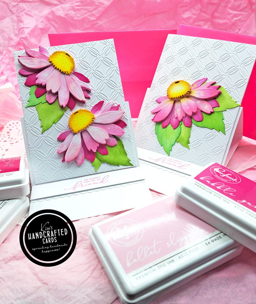
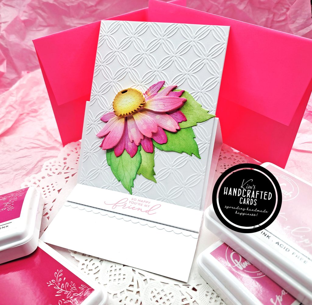
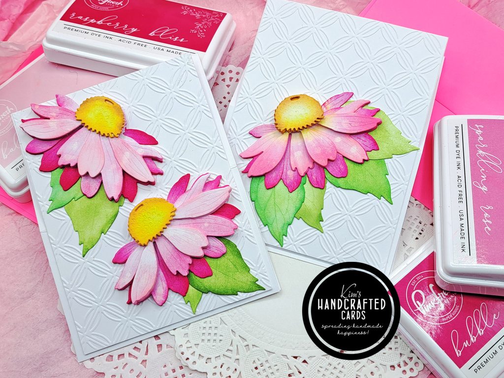
Instantly, I broke out the die set, my little workhorse; Sizzix Sidekick Die Cutter, gathered up all my pink inks: (Ballet Slipper, lightest, Sparkling Rose, next lightest, Bubblegum, darker and Raspberry Bliss, darkest) from Pinkfresh Studio and went to work!
I die cut all the petals twice on white 100 lb. cardstock and colored the bottom petals with the darkest pink and a heavy hand moving to Bubblegum for the next set of petals on down to Ballet Slipper.
I added foam squares only twice under a couple of the layers, cause I wanted dimension but not too much. I die cut the centers (there’s 2 of them in the die set), twice on white cardstock too. So, they have a total of 4 layers and that really added some dimension!
On the centers of the florals, I used “Marigold” and “Doe” from Pinkfresh. These two colors work so effortlessly together. Doe is a beautiful brown color, so, I started coloring around the outside of the center portion with a heavier hand and coming into the center with a lighter stroke. I colored the edges with Doe to make the centers have a little more realism (LOL)! For the leaves, I colored them with a mix of the bright and muted greens from Pinkfresh to make them all look unique.
then…
I glued my florals together and I discovered something strangely beautiful…
I accidentally got some liquid glue on top of one of the floral petals and as I was trying to wipe it away with a paper towel, it left some white residue that mimics watercolor splatters that we crafters all love. I thought about ink blending again on top of it to cover it up but as I looked at it, I LOVED IT and decided to leave it. In fact, I added glue spots to more petals and with a paper towel, dabbed the excess away and let the glue dry. It gives the petals texture and more interest! Amazing!
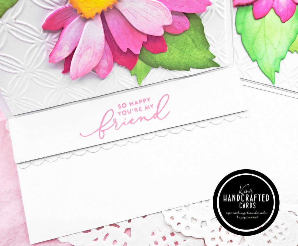
Once I was done with the florals (3 in total), I set them aside and began working on my cardbase. To really showcase these flowers, I decided to use the Easel card technique. This card design is so fun and so easy to make! If you’ve never tried it, I highly recommend it! Jennifer has a great video tutorial here that I use when making easel cards.
Putting it all Together
Next was to construct my easel cardbase. For the panel that the coneflowers would sit on, I used an embossing folder from my stash by Cuttlebug/Provocraft. I don’t know if this folder is still available, but any embossing folder will immediately dress up a plain white card panel. I also trimmed the panels (2 cardstock sheets for both cards) to 4″ x 5-1/4″ glued them together. This gives my panel some strength to hold up the flowers.
Time to work on the stoppers (the piece that goes inside the card and will keep my panel up without falling down). For this, I trimmed several pieces of white cardstock to 4″ x 1-3/4″ and glued them together. Finally, I stamped my sentiment using Simon Says Stamp’s “Sketched Flowers” stamp set with “Guava” Pawsitively Saturated Ink.
I adhered the stopper, adding a little scalloped edge from Pinkfresh Studio’s Scalloped die set and the florals on the panel and tested out the card and it sits up perfectly! And, there’s plenty of room inside the card for a personal message.
I was blown away at the end when I saw the cards but even so from the pictures. I hope you like these cards too! If you’re a crafter, I encourage you to try using other colors, even ones you don’t grab for a lot. You’d be surprised what you can create! Thanks for reading!

- Honey Bee Stamps Lovely Layers Coneflower Die Set here or here
- Pinkfresh Studio Full Collection of Inks
- Pinkfresh “Fairy Dust” Pink Inks Collection
- Simon Says Stamp “Guava” Pawsitively Saturated Ink
- Simon Says Stamp “Sketched Flowers” stamp set
- Pinkfresh Studio “Scallop” Frame Die Set
- Blending Brushes, large size here, tiny size here
- Spellbinders Platinum 6 Die Cutting/Embossing Machine here or here
- Accents 100 lb. White Cardstock
- Bearly Art Liquid Glue
- Glassboard Craft Mat → Use my Code → KIMCARDS20 at checkout
- Craft Reverse Tweezers by EK Tools (great for picking up die cut pieces)
- Misti Stamp Positioner
- Paper Trimmer: Tim Holtz here (Ranger), here (Scrapbook.com) or here (AZ)
- Sizzix Sidekick Die Cutting Machine or here
- White double-sided foam squares