Hey Crafties, it’s that time again to share some cards that didn’t quite make the cut for sharing. Each month, I share a few cards that either I made some mistakes or I couldn’t quite capture my vision. This series isn’t written to make me feel sad but I use these as learning lessons for improvement.
PLEASE NOTE: this series is not to bash any products used. I LOVE all my crafty items! The mistakes I outline are all pilot errors!
Some are small errors that I just need to be aware of in future while others, maybe my vision for the design didn’t quite work out and needs some adjustment. And, I like to try re-making these types of cards to grow my cardmaking processes. So, let’s get to the lookbook and why I chose these cards for this post and there’s quite a lot to share!
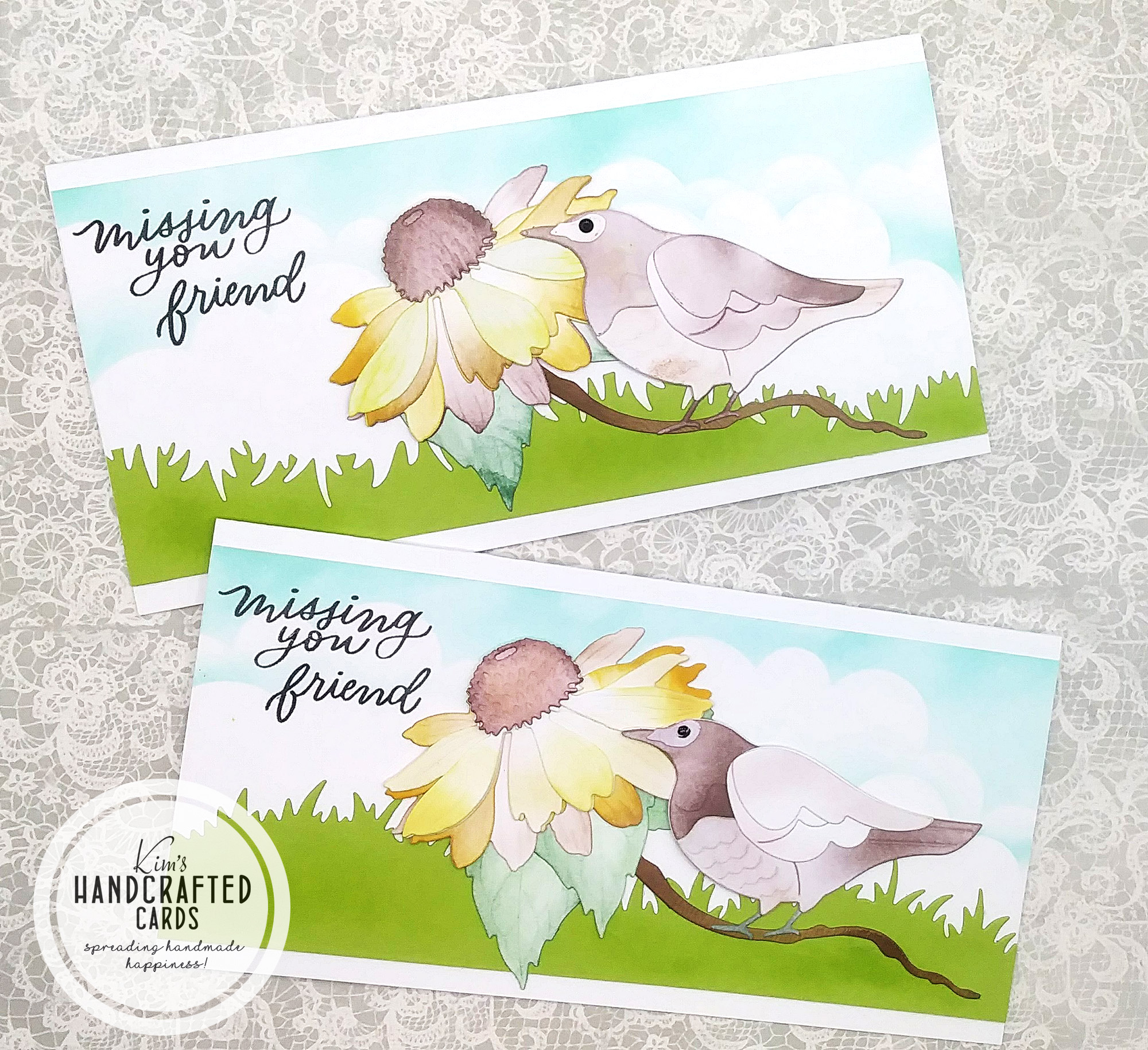
Card Design #1
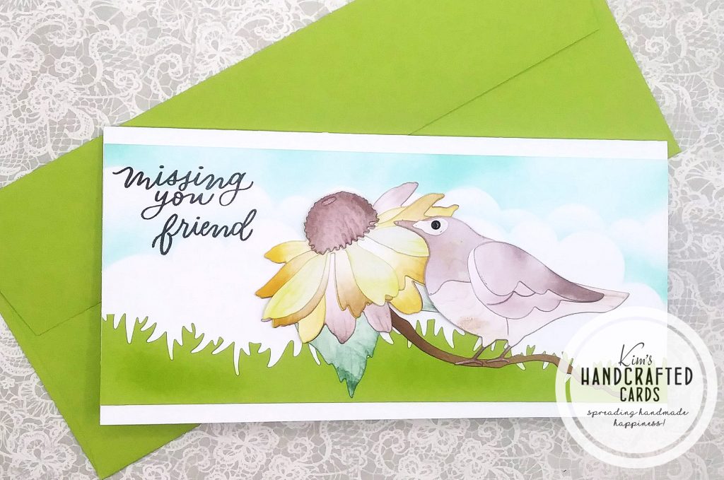
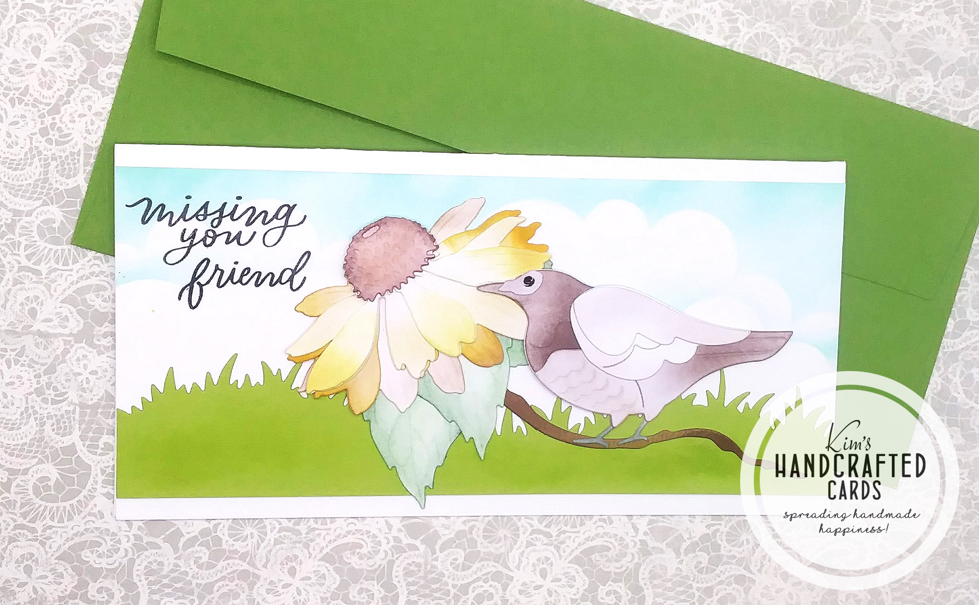
My vision was to use my grass die and a blue sky in the background with a large flower and bird perched near it with a sentiment. And, I love how the coneflower and the background look. However, I don’t think the colors I chose for my bird matched well + I think maybe the bird was too large for the scene. If I make this slimline card again, I think I would choose a smaller bird.
Products Used
- Simon Says Stamp “Clouds for Days” stencil
- KSCRAFT Slimline Grass Die Set
- Sizzix “Spring Bird” Layered Die set
- Honey Bee Stamps Lovely Layers Coneflower Die Set here or here
Card Design #2
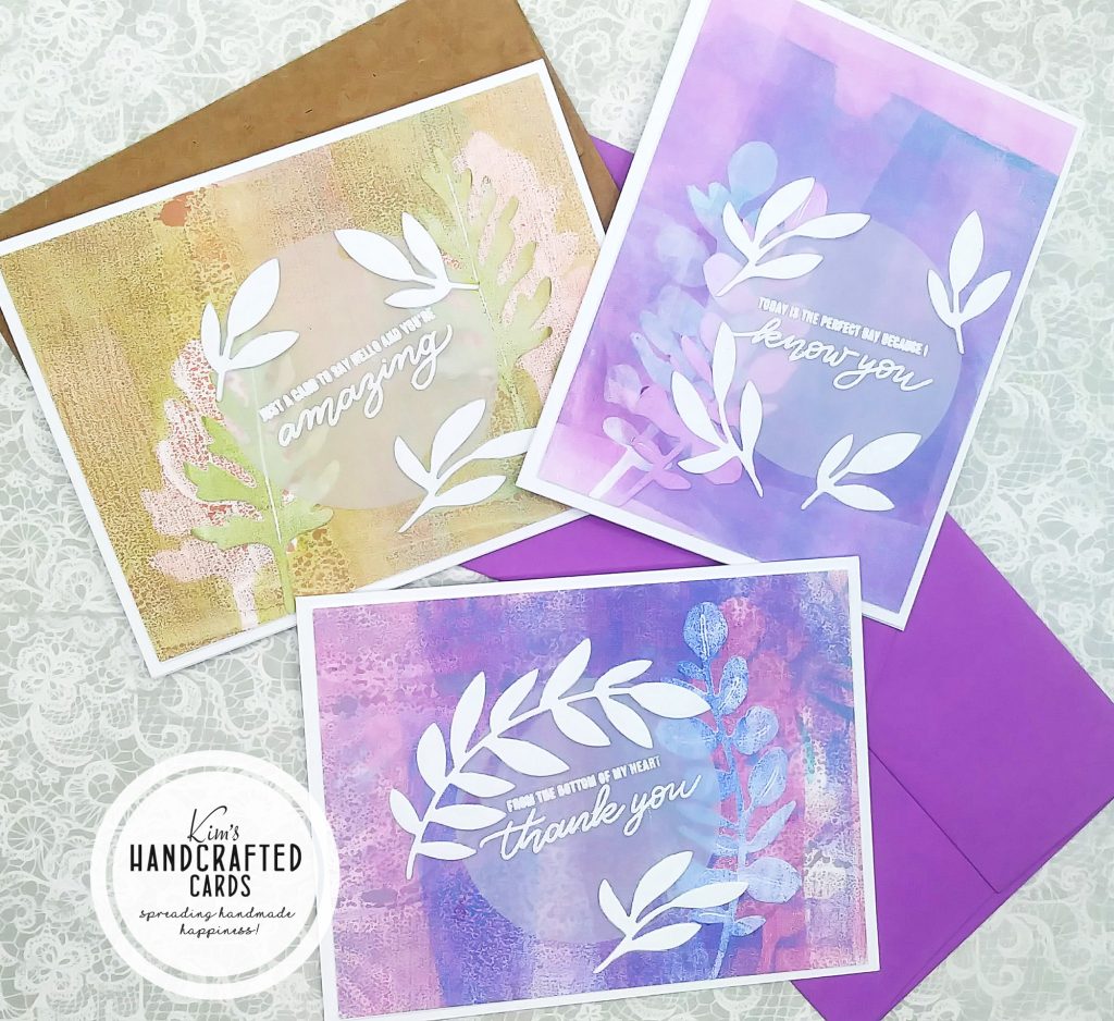
I shared the purple card on the top right on my social media, but the other 2 I didn’t. I think it’s because my execution on the gel press background didn’t match my vision. The landscape purple card has too much purple for my liking. I wish I had tried a few other colors, maybe yellow, to tone down the purple a bit.
With the brown card, same thing, should have paired the background with other colors. I also don’t think I got the same texture with my brayer on these 2 cards as with the top right card. I like the cards in this post with my gel press much better! Need more practice!
Products Used
- Gel Press 8 x 10 size, 5 x 7 size here
- Brayers
- Distress Oxide Inks (Collections and Bundles available too)
- My Favorite Things “Die-namics Grand Greenery” Die Set
- Sentiment by Simon Says Stamp (no longer available)
Card Design #3
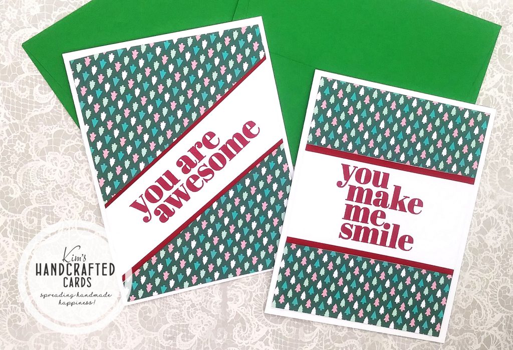
These cards came together perfectly except….. the card on the left, I glued the background upside down, put the whole card together and didn’t realize my mistake until I saw the photos! UGGGGHHH!
Products Used
- Catherine Pooler Christmas paper pack
- Simon Says “All about You” Stamp Set
- Simon Says Stamp red cardstock
Card Design #4
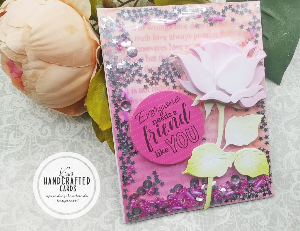
This card was supposed to be a flat shaker card and I’ve made tons of these before, but where I went wrong I think is the type of shaker bits I used and I don’t care for the background coloring over my stamped image. First, I think I should have used lighter colors and for the shaker bits, maybe something more translucent or white gems. I also put too much foam squares on my Rose, way too much dimension! I feel that my sentiment competed too much with my background. I know that contrasting colors works best so maybe my brain was on vacation this day when I made this card! LOL 😀
Products Used
- Simon Says Stamp “Love Is” Cling Stamp
- Simon Says Stamp Pawsitively Saturated Ink Collections
- Honey Bee Stamps “Rose” Lovely Layers Die Set
- LZBRDY Sentiment Stamp Set (AZ)
Card Design #5
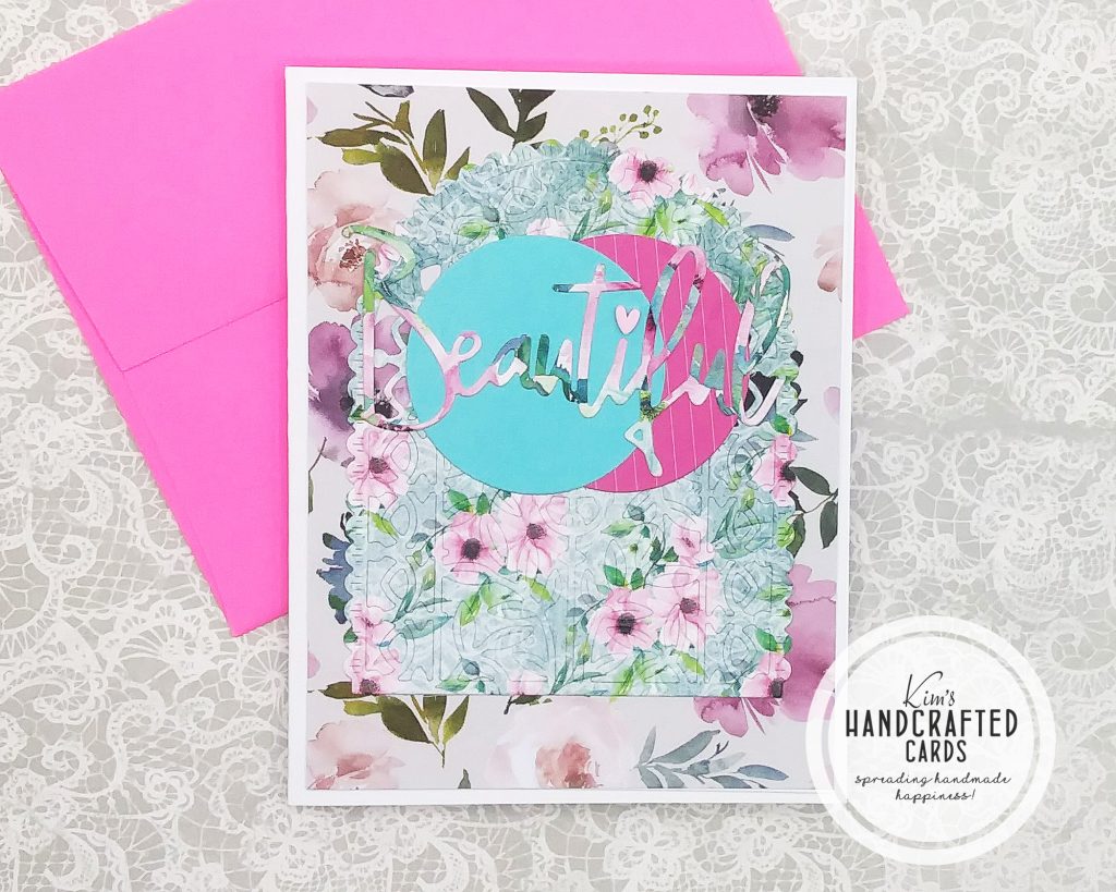
This card is just too busy. As I was making it, I liked it but after I walked away, came back and looked at it again, I just felt I had too much going on. To remake this card, I would add a solid cardstock in between the arch and the background. Also, the word die should be in a solid color as well or maybe add the shadow in white and then the letters could be colorful.
Products Used
- Paper Boutique Damask Delights Collection – 8 x 8 Paper Kit
- Dress my Craft Magnolias 12 x 12 Paper Pad or here
- Spellbinders Arched A2 & Slimline Card Creator Die Set
- Pinkfresh Studio Essentials “Classic Word Dies”
Card Design #6
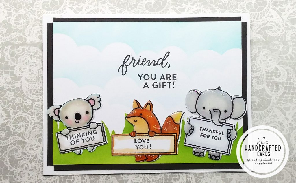
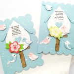
I’m brand new to “scene building” cardmaking so I was trying to create this card with some cute critters holding signs with different sentiments. However, I don’t really like how this turned out in the end. I can’t say that I made mistakes except I shouldn’t have added Crystal Glaze over my critters. It could also be a composition problem. And, maybe I just need more practice!
Products Used
- KSCRAFT Slimline Grass Die Set
- Simon Says Stamp “Clouds for Days” stencil
- Pretty Pink Posh “Animal Signs” Stamp Set
- Sentiment from Simon Says Stamp “Friendly Flowers” Stamp Set
Card Design #7
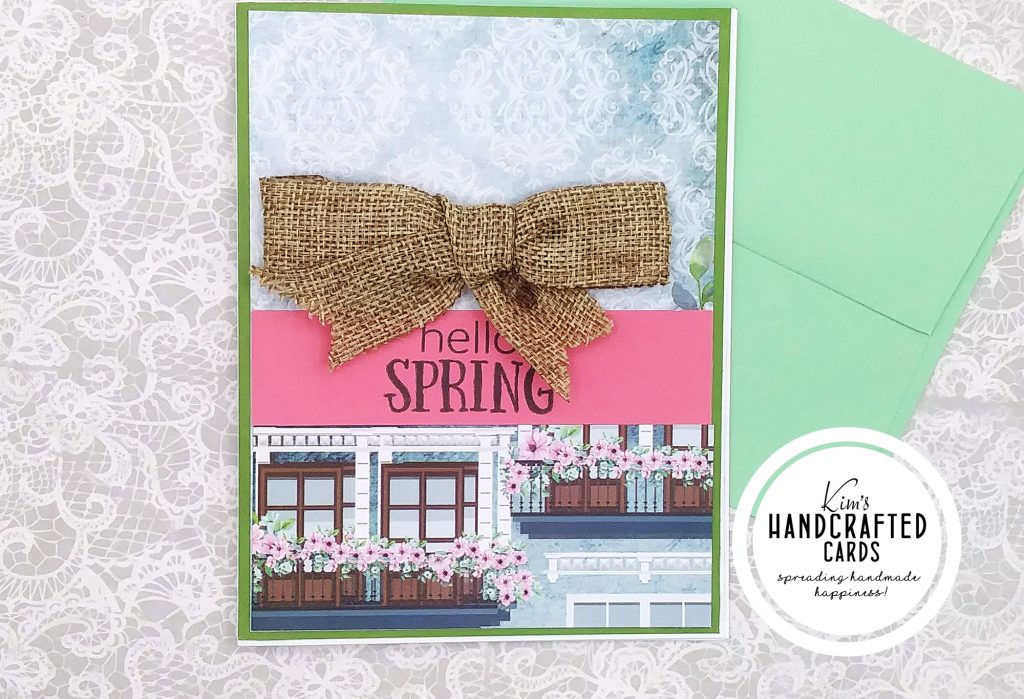
For this card above, I had this idea of making an outside scene with a bow and Spring sentiment, however, I think I chose the wrong ribbon and color cardstock for my sentiment. I think a white or cream ribbon would work better and maybe the sentiment should be white heat embossed over a color cardstock or have it over white cardstock stamped in black.
Products Used
- Dress my Craft Magnolias 12 x 12 Paper Pad or here
- LZBRDY Assorted Sentiments on AZ
- Berwick Offray Brown Ribbon
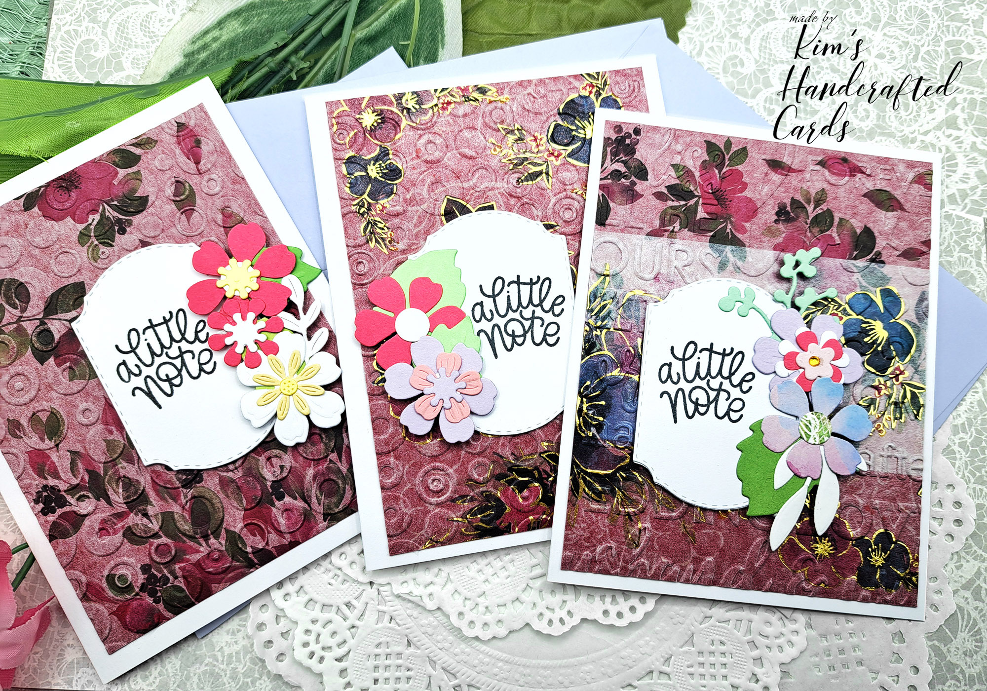
Card Design #8
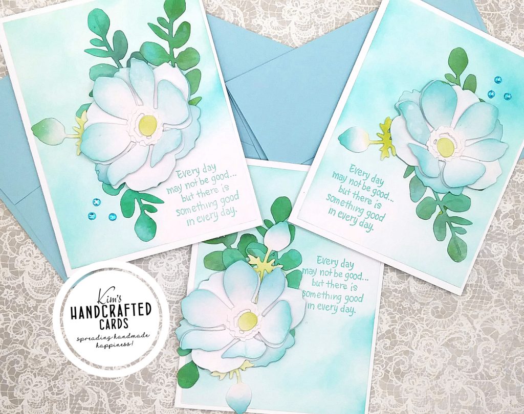
If you’ve been reading my posts or seeing my cards lately posted on social, then you know how much I LOVE, LOVE Honey Bee Stamps Lovely Layers die collections. However, these 3 cards I think I went wrong with my color choice for ink blending my backgrounds. The flowers are pretty, I would change the leaves color to a more olive tone though. But, anyway, the background could have been plain white, or I should have used a cover piercing die or even a light pattern paper to create that contrast look. Finally, I would stamp the sentiment in black, not blue.
Products Used
- Honey Bee Stamps “Lovely Layers” Anemone Die Set
- Simon Says Stamp Pawsitively Saturated Ink Collections
- Welcome to Joyful Home Sentiment 4-piece Stamp Set
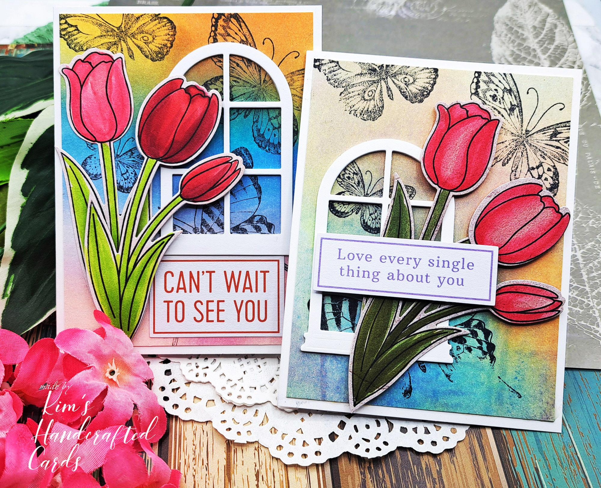
Card Design #9
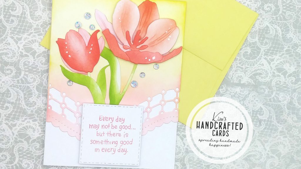
This card kind of confuses me because there’s elements I really like but maybe my color choices don’t mesh well. The sentiment may look better if stamped in black. And, to add more contrast, perhaps I could color my Tulip and bud with a different color palette. I may have to think more about this design before trying it again!
Products Used
- Honey Bee Stamps “Lovely Layers” Tulips Die Set here or here
- Welcome to Joyful Home Sentiment 4-piece Stamp Set
- Spellbinders Universal Curved Border Set – Large Die of the Month
- Simon Says Stamp Pawsitively Saturated Ink Collections
That’s it for April’s 2022 Cards that didn’t quite make the cut! Again, there’s absolutely nothing wrong with the products I used. In fact, I’ve used many of these in other cards that turned out great! This series is for me to learn from my errors, make changes and become a better cardmaker. And, that’s what we humans always do, right?!, we try to improve our skills 🙂 Thanks for reading!